PAUL AND MIKE CHOCOLATE
Studio Glyph partnered with Synthite Industries, a global leader in fragrances and flavours to help develop a new brand of chocolate. Two years in the making, Paul and Mike are the names of the two Caribbean cocoa experts who taught Synthite everything they needed to know about the fine art of making chocolate. The peculiar challenge we faced was the massive gap of knowledge in the market - most chocolate lovers believe ‘foreign’ chocolate is higher quality. Whereas that is not the case. Much like the wine industry, the quality of chocolate has a lot to do with the provenance, genetics and nurture of the crop, along with precision processing techniques.

THE BRAND VISUAL
The main distinguisher of the product in the market, was that we also ‘farmed’ the cocoa trees - something many can not claim to be able to do. Our brand language constitutes of modern illustrations that represent the farming and processing of the cocoa, along with a colour palette that’s fun, and an illustration style that is contemporary and modern.


PACKAGING DESIGN
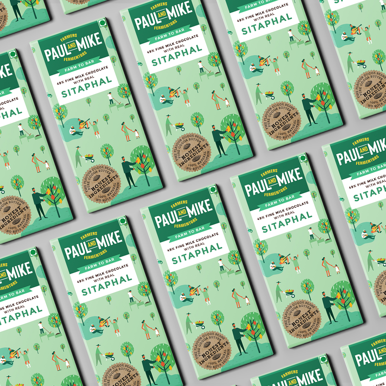
Pictured above are a few of the variants that are a part of the initial 10 flavour set that Paul and mike launched with. With much deliberation and discussion, certain tactical elements were designed and included in order to convey certain aspects of the brand - without explicitly saying so.
We leveraged every face of our packaging - especially since most of our consumer base is yet to be initiated into the finer aspects of chocolate making. Here, we needed to take on the mammoth task of informing chocolate lovers of the details that they need to look out for while buying chocolate. In doing so, we made the packaging a story telling tool, as well as included interesting trivia for those who were curious. The colourful fun illustrations worked at a subdued level for our audience who isn’t very academically inclined. We used multiple tools to make our packaging as hardworking as it is - explained in the image below.


The Design Evolution
OUR FARM TO BAR DIFFERENCE


Half the challenge in communication design lies in distilling complex information into easy tid-bits that are consumable by the audience, even without any prior knowledge of the subject. Above is a series of three steps that we de-coded the complex chocolate making process into, featured at the back of the packs.
PHOTOSHOOT ART DIRECTION
For any new brand, the first order of business after the product itself, is a photoshoot that conveys aspects of the brand. We worked with photographer Arundhati Rasam to create a series of images that would help us convey the texture and personality of our brand, implicitly.


Design for two sizes of gift packs, carrying a mix of 5 and 10 variants.