UNO MÁS
Uno Más (meaning ‘One More’ in Spanish) is a newly launched Tapas, Bar & Kitchen in Mumbai. Studio Glyph partnered with promoters Pallavi Jayswal & Priyanka Sharma to develop an identity that transports one to the streets of Spain. Drawing inspiration from this culturally rich country, we’ve played with elements like flamenco dancers, matadors and mosaic that add fiesta to the food.
THE IDENTITY & WORD MARK
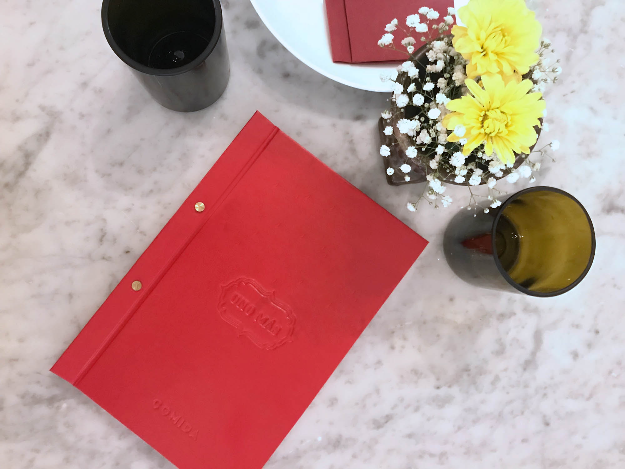
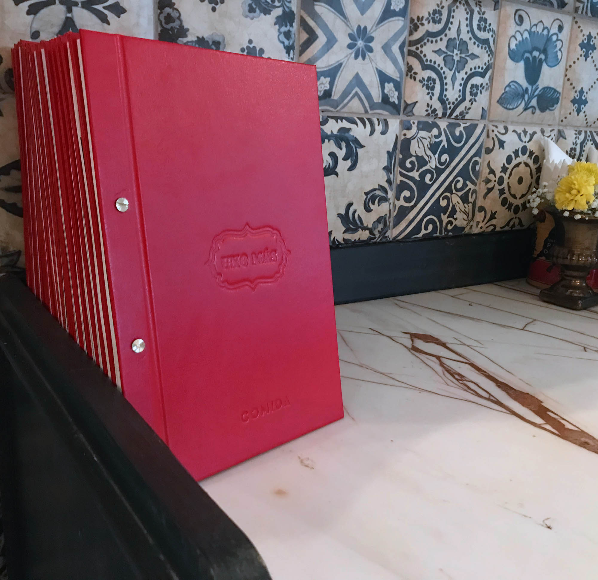
The logo is an ornamental yet bold typeface, inspired by vintage Spanish typography; encased in a frame inspired by wrought iron accents that adorn Spanish architecture, whether on doors, signages, lamp posts or verandahs.


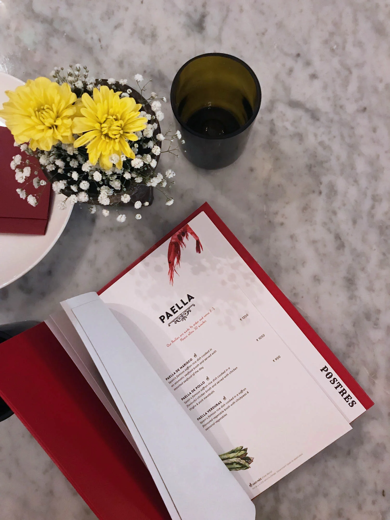
THE MENU
A restaurant’s primary mode of communication is the menu. We took special care in the way the menu was created, right from the layout and design, to typography and illustrations. Using fun infographics made the menu informative as well as approachable to guests experiencing Spanish cuisine for the first time.


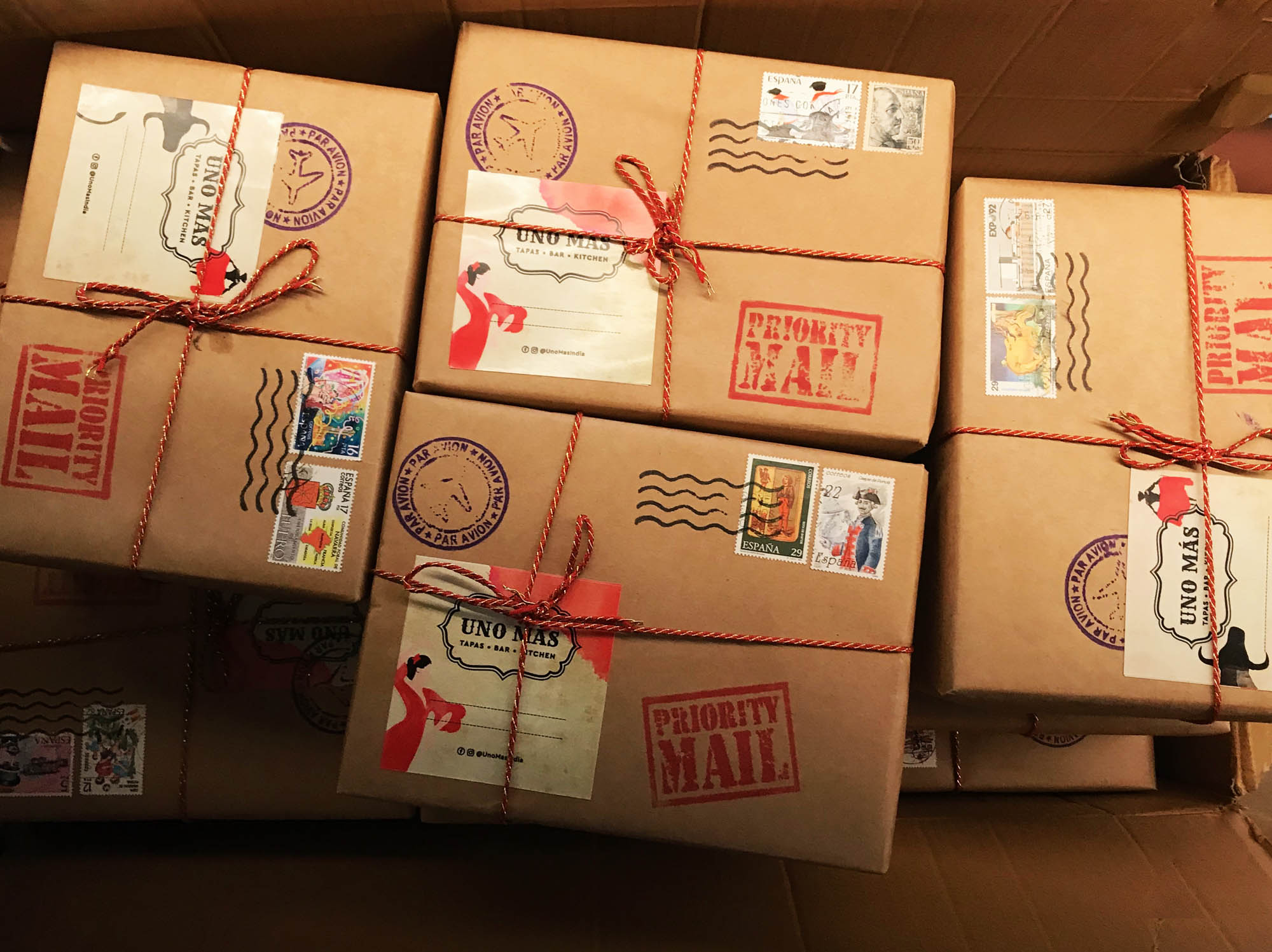
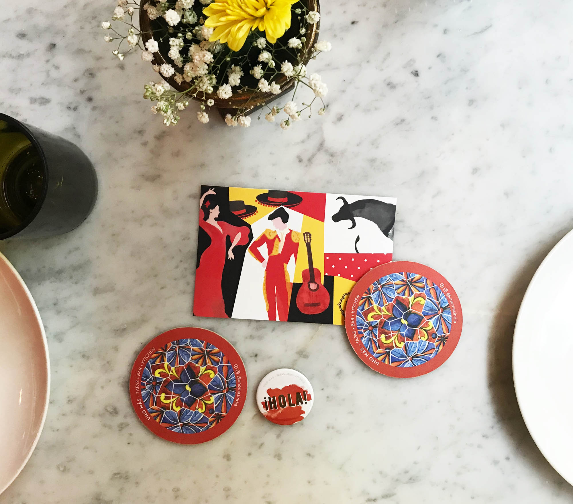
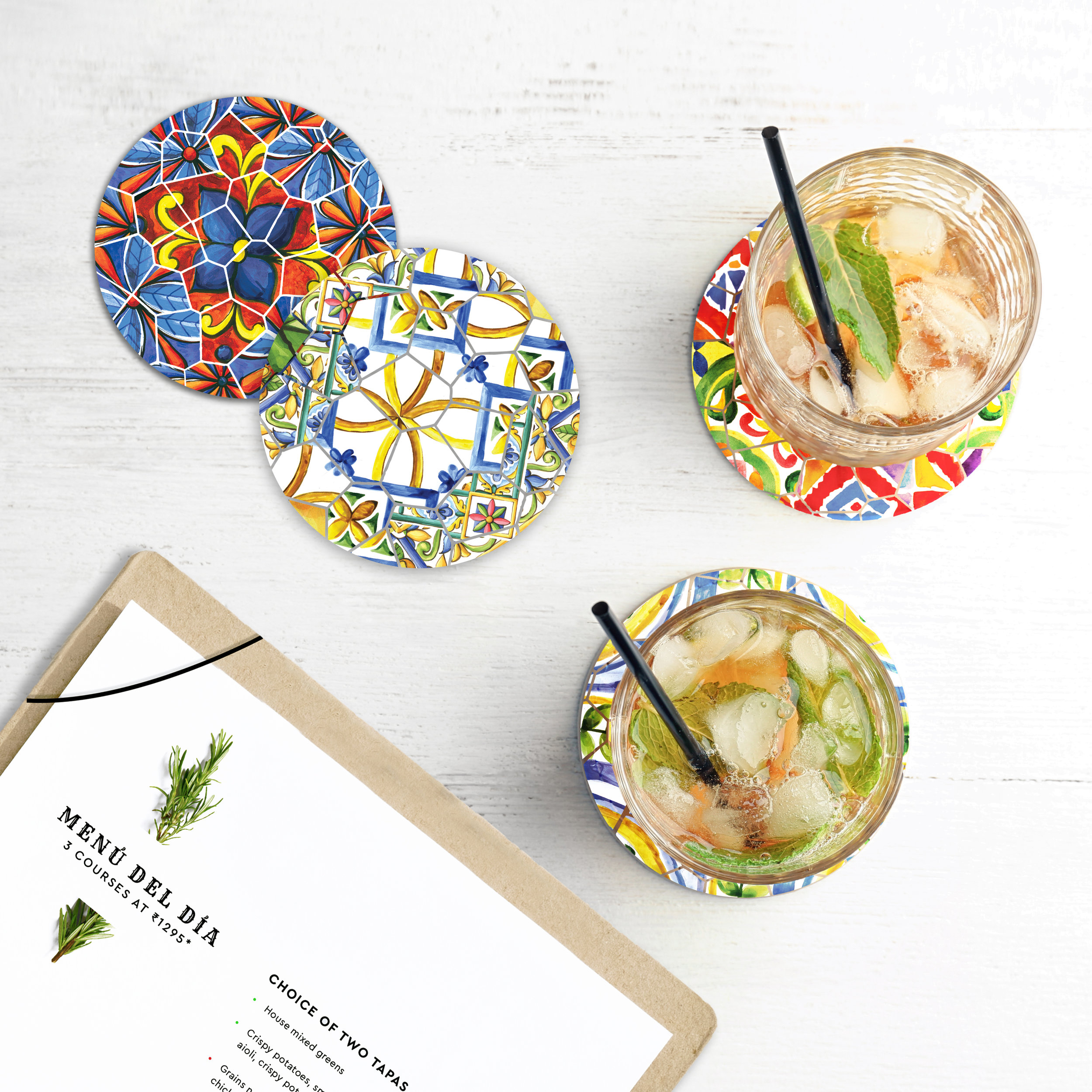
THe MERCHANDISE & BRAND EXTENSION
We created a series of fun watercolour illustrations primarily using the Spanish flag colours, red and yellow. When paired with the black and white logo, a bold and contemporary identity is brought to life. We used Spanish words like Hola, Ole, Hasta La Vista, and more to reiterate an authentic Spanish experience.
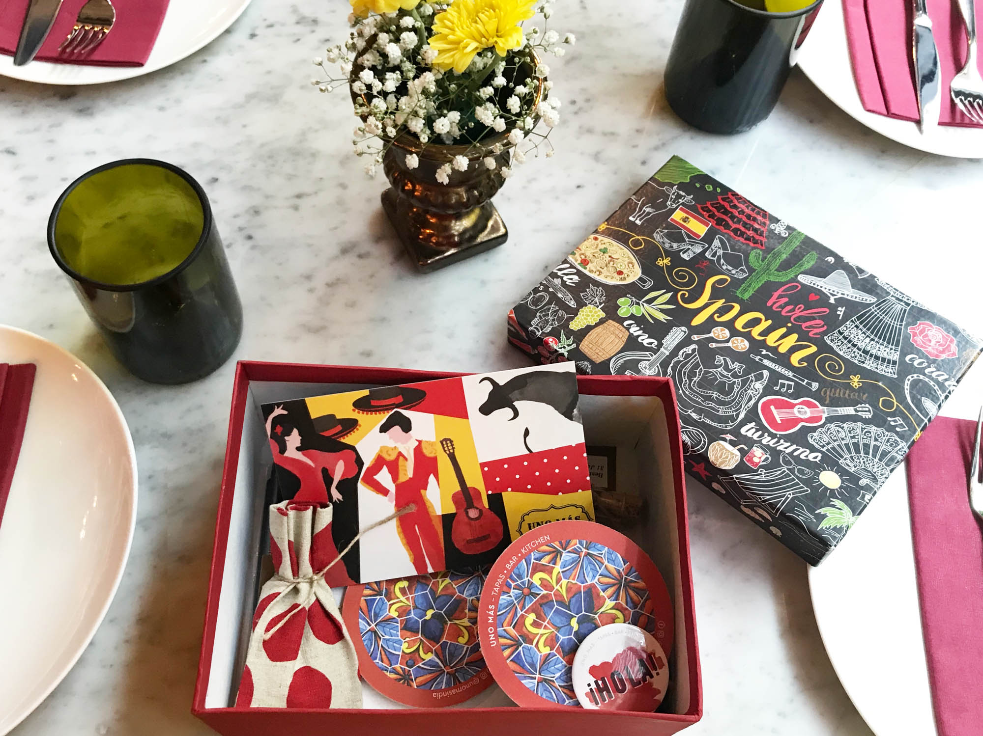


Every box went with a little product information card (shown below) to explain the directions of usage, key ingredients and benefits.
The packaging had a lot of key content that helped distinguish the brand. Instead of compromise the simplicity of it, we decided to use our core graphic design skills to generate a set of icons that would add the necessary information, without making it too wordy.