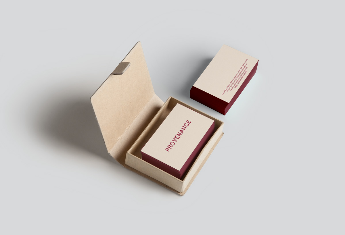
PROVENANCE
When long time client, Burgundy Hospitality approached us for their newest, homegrown venture, we jumped at it. A novel retail idea of rare products sourced from nooks and crannies across the globe, this gifting brand is luxurious and unique. With a cafe cum store, they launched in the prestigious location of Palladium. Studio Glyph partnered with them to create their brand identity, packaging material for gifting and white-labelled goods, along with their other in-store communication requirements.
WORDMARK
Inspired by European bistro window decals, the logo is nostalgic yet contemporary. In a rich gold against burgundy, the identity looks as plush as it promises to be. The abstraction of the map in the background conveys the varied geography of the storied products that they offer. Through this venture, Burgundy Hospitality hopes to help customers discover treasures that they never knew to exist.
The word mark in its permissible colour ways. Gold & Wine.
ART DIRECTION FOR PHOTOSHOOT
We worked closely with the Provenance team to create a visual language for the shoot that would showcase the product range and packaging. The idea was to use precise placement to represent the methodical and detailed thinking that goes in to the curation of these products, along with familiar terrazzo as a backdrop, a salient feature of the in-store experience along with gold elements, to retain a connection with the brand identity and luxurious feel of the brand.
The Packaging
With a range of such rare and exotic products, Provenance naturally finds itself in the position of the perfect brand for gifting. Hence, the packaging for gifting became the centrepiece of our design work, and we ensured that the brand values carried through seamlessly through the multiple formats of gift packaging. To complete the bouquet on offer, some products are white-labelled - which gave us the opportunity to extend the branding to our own range.
Book style packaging for the Chocolate Library
The cafe and store
In-store display unit with coffee packaging
Packaging for honeys, preserves and spreads.
Coffee packaging and product story placard
Takeaway Coffee cup
Gift packaging labels for chocolate along with product story
The chocolate library with its product story


